Prerelease:Yo-kai Watch (Nintendo 3DS)/Early Development
This is a sub-page of Prerelease:Yo-kai Watch (Nintendo 3DS).
| To do: https://nikkan-spa.jp/700091 |
| ...But what does it mean? This game has text or audio that needs to be translated. If you are fluent with this language, please read our translation guidelines and then submit a translation! |
Contents
Early Development
Initial Concept
In 2010[1], Akihiro Hino wanted to create a new franchise which would be the successor to the cross-media testing grounds that happened in Inzauma Eleven and Little Battlers eXperience, that can compete with something that has lasted for "20 or 30 years"[2].
The franchise was originally conceived by Akihiro Hino when one day, the keyword "youkai" (妖怪) came to his head, as a monster-catching game. He noticed that there were no such games that had "youkai" in the title at that time (despite some creatures in other monster-catching games being based off them), due to them having "monster" (モンスター) as keywords for it instead. He explains this further in an interview with Natsuhiko Kyogoku, a writer of mythology;
京極 "まずは“妖怪”の特質を把握されたかったんですね。"
日野 "そうなんです。妖怪や不思議なものの作品を作りたいと思ってはいるものの、レベルファイブはゲーム会社なので、やはりビジネスとしてもヒットするものを作らなくてはいけない。そういう視点で現在のゲーム業界でヒットしている作品を見渡してみると、ことごとくみんな“モンスター”と名のつくゲームが多いんですね。"
京極 "『ポケットモンスター』や、『モンスターハンター』、『モンスターストライク』などなど、多いですよね。モンスターが。"
日野 "しかも、どの作品も大ヒットしています。モンスターと名前をつけると売れるのか、というほど(笑)。とくにたくさんの“モンスター”のキャラクターが出てきて、集める要素があるゲームは、子どもたちに人気なんです。こうした状況を見渡して見て、ふとモンスターではなく、昔好きだった“妖怪”をテーマにしたならば、もしかしたら上手くいくかもしれないし、おもしろいものが作れるかもしれない……そう思ってこの企画に取り組み始めました。なので、モンスターと妖怪というのは何がどう違うのかというのをしっかり考えて作らなければと感じて。そうした視点で改めて分析して見たところ、モンスターは「グルルル」と唸ったり「パオーン」などと鳴いたりする、いわゆる“動物”的な要素が核になって構成されていると気付きました。それならば、妖怪は動物的ではなく、“人間”として作ったらおもしろいだろうと思いついたんですね。"
— Akihiro Hino, Big Hit Yo-kai Entertainment Manners", Famitsu - October 2019
He was thinking of ways to mix it with a newer era[3], he came up with the keyword "Watch" (ウォッチ); a more modernized way of the word for "Clock", or tokei (時計) in Japanese. Both words were combined to create "Youkai Watch" (妖怪ウォッチ), which evoked that of an enigmatic[4], yet "new and old" feeling, where "youkai" are represented as strange and "Watches" are represented as mechanic and familiar to people.[5] He came up with the word combination when he was riding a taxi.[6]
From that wordplay, the designer came up with various ideas[7], including Yo-kai Watch itself, which resulted in Hino assuming that merchandising would be created from the drafts. He also wanted to expand on the interlocking effect that was previously done with Little Battlers eXperience.
During early conceptualisation, the franchise was originally intended for "men and women" due to the younger audience already liking Inazuma Eleven. The initial worldview of Yo-kai Watch was completely different, which was reminiscent of Gegege no Kitaro.
First Characters
He tasked character designer Takuzo Nagano to design the characters for the franchise, who had previously worked on Inazuma Eleven. Nagano was full of passion to design the characters after hearing Hino's idea that was jotted down on a bulleted list. The imagining of "youkai" in Nagano's head came to him as "an old-fashioned setting" and a "an image of a youkai that has been passed down for a long time".
"登場人物が箇条書きで書いてあり、妖怪ウォッチがどんな役割を果たすのか、など簡単な内容が書いてありました。 “妖怪”がテーマなので、古い時代設定だと思っていました。僕がイメージしていたのは、昔から伝わる妖怪です。そのため、昭和な雰囲気を出しつつ、でも『ゲゲゲの鬼太郎』まで怖くなく。でも、藤子不二雄A先生の『笑ゥせぇるすまん』的なブラックさも要求されていました。"
— Takuzo Nagano, Interview with Character Designer Takuzo Nagano of Yo-kai Watch, The Story Behind The Creation of "Jibanyan" Told By The Creator", ddnavi - December 2014
The first drafts were designed to "not be cute", where he took notes from books about mythological youkai[8]. He originally designed them with a Showa Period atmosphere in mind while "feeling scared of Gegege no Kitaro", and taking notes from the sinister personality of the Laughing Salesman.
At the 2016 Tokyo Museum exhibition, early character designs of Jibanyan and Whisper were shown off. Photography wasn't allowed at the exhibit later on, so few surviving images remain. Though Whisper's sketches were previously featured in a pamphlet about the first movie, a never-before-seen design could be seen at the exhibition.
Whisper
First Design
| Artwork (surviving photo) |
|---|

|
Whisper was the very first Yo-kai to be designed for Yo-kai Watch, resembling that of an anthropomorphic will-o-the-wisp and teru-teru bozu. When he was designed, he would go on to pave way for the worldview of Yo-kai Watch during development, where many of the Yo-kai used thick lines so it could be easy to draw for children.
A teru-teru bozu Yo-kai design wouldn't be used until Yo-kai Watch 3, for Yo-kai Mr. Blue-Shy.
Jibanyan
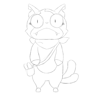
First Sketch
| Surviving Images | Recreation |
|---|---|
|
|
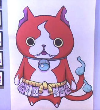
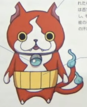
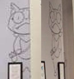
Jibanyan was the second Yo-kai to be designed for Yo-kai Watch, where Akihiro Hino wanted Nagano to create a bakeneko character due to its prominence in Japanese youkai mythology. Nagano said that Jibanyan's chipped ears and a "fireball" pattern on his forehead were added to show Jibanyan's grudges from his death. Curiously, in the September 2014 issue of Degenki Nintendo magazine, Nagano said that Jibanyan's design originally had a "darker edge", where it had a "taller head" which is likely referring to this design above.
"ジバニャンは地縛霊。だからかなりの怨念を残していったのではないかと考えたのです。耳を削って事故にあったことを表現したり、猫の執念深さを表すために、シッポは二本にし、そして顔は火の玉模様。 あと、昭和のイメージが頭にあったので、腹巻きを付けました。僕は『男はつらいよ』の寅さんが好きで、かつ造形的にもひと癖付けたかったからです。だから僕のなかでは、腹巻きに手を突っ込むオッサン像を勝手につくっていました。"
— Takuzo Nagano, Interview with Character Designer Takuzo Nagano of Yo-kai Watch, The Story Behind The Creation of "Jibanyan" Told By The Creator", ddnavi - December 2014
Curiously, the design would be used for Lightside Jibanyan in the Yo-kai Watch Shaodwside series, fitting with the spin-off's darker tone. Though features from Jibanyan's final design would be worked into the character.
Change of Direction
Sometime during the conceptual stages, Yo-kai Watch's target audience was changed because Hino thought that it was awkward or couldn't embrace any emotions. So the target audience was changed to be for children.
"元々、ゲームのターゲットは、“男女両方の子ども”でした。当社でリリースしている『イナズマイレブン』は、同じく子ども向け作品でしたが、サッカーがテーマ。どちらかというと、男子がメインでした。今回は、男子女子の両方から好かれなければいけない。
そのためキャラクターはよりかわいらしく調整が加えられていきました。きっと当初のキャラクター設定では、ここまで人気はでなかったでしょう(笑)"— Takuzo Nagano, Interview with Character Designer Takuzo Nagano of Yo-kai Watch, The Story Behind The Creation of "Jibanyan" Told By The Creator", ddnavi - December 2014
It was also when the series started to take influence from Doraemon, because it hasn't been done by other companies in recent years, as most of them were focusing on stuff such as "hero battle things". The decision was a good idea and expanded Hino's visions and optimism for the franchise's hoped longevity like the source of inspiration. Hino also brought up comparisons to other multimedia IPs such as Little Battlers eXperience to Gundam, and Inazuma Eleven to Captain Tsubasa as examples, acting as modern-day representations of source material.
To apply with the setting for modern audiences, several of the character inspirations have to had their personalities change to fit the contemporary setting,[9] and Yo-kai were redesigned to look "familiar, a little creepy but cannot be detested".[10]
It was also the stage where Akihiro Hino wanted the game to be like "children's open world game" from his experience of playing overseas open-world video games, where he wondered what a city-like setting would feel like if it was a playground.[11]
Unlike the other two projects, the basic plotline of Yo-kai Watch wasn't written until near the end of development in order to aim for a simpler story with simplistic settings reminiscent of other long-running franchises such as Sazae-san and Doraemon.[12]
Later Designs
Yo-kai
Whisper
| To do: Get a scan of this, and crop the designs? |
Nagano said that the conceptualization process for Whisper wasn't easy and wanted to create a design that would still keep it's "Yo-kainess" and that would be "accepted by children", comparable to seeing a character recognizable by it's silhouette.
"ウィスパーが今のように決まったので、妖怪ウォッチの世界観が決定しました。僕は子どもにマネして描いて欲しかったので、細い描線にはしたくありませんでした。 キャラクターを考えるときは、“かわいらしさ”と“怖さ”をどの程度盛り込むのか調整しながら案を出しました"
- Takuzo Nagano[13]
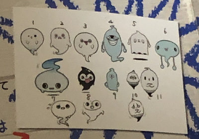
A total of eleven designs were considered for Whisper, and the fourth design ended up being picked. Nagano noted that his blue-colored cuticle was always smiling, so it could give off "a feeling of eeriness" while also having an unthinkable expression to the viewer.
The other designs didn't go to waste; the ninth was used for Fuu 2 in Yo-kai Watch Blasters: Moon Rabbit Crew and the tenth and eleventh ended up being used for Daizn't's color scheme in the final game.
Jibanyan
A couple of later designs that look "cuter" were drawn, where it took notable inspiration of the titular character from Doraemon in terms of the bell and overall round shape. To keep Jibanyan's character design feature of carrying "seals", many different accessories were considered such as a rope and kung-fu belt before Nagano went with a haramaki in the end because it affected the overall design of the character, making it a "cuter and round shape".
The haramaki which was added in comes from Nagano's image from the Showa Period in his head, where that accessory was popular at the time. Nagano also brought up that he liked the main character Tora-san from the Japanese film series Otoko wa Tsurai yo, who also wore a haramaki which was why he wanted to add it in.
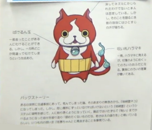
On a design draft that was shown in 2019 during the launch presentation of Yo-kai Watch 4, Jibanyan had abilities that were scrapped or changed around in his final design. Though the top part of the draft was completely covered up.
From left to right:
| Transform Orb | (covered) | Curse Seal Haramaki |
| Lets him transform into people he has met once before.
However, his weakness is that when he transforms using his own power, it’ll be slightly off. |
He himself says that they were definitely not bitten by mice or anything.
However, when he says that, sweat starts running down his face. |
At first glance, it looks like a haramaki, but pieces will peel off like sticky notes and turn into curse seals.
The cursed words are written on the backsides. |
| Backstory | ||
| A cat who suddenly got into a traffic accident one day, and died.
Because of all his resulting bittnerness, he became a “jibakurei cat”. However, he felt (illegible) in this “jibakurei” system, where he must always remain at the same place, and began to inspirit people. It seems that recently he’s been reflecting upon his pranks that have become more like “curses”, lamenting: “It’s not easy to admit to the mistakes of one’s youth.” He’s always dreaming of reuniting with his former owner “Sae-chan”. | ||
- Jibanyan's "transform orb" was supposed to let him transform into humans and was one of the earliest ideas, according to Akihiro Hino in the video. He cannot transform into other humans in the final product, but it was changed into his Inspiriting power which was only shown in the first episode of the Yo-kai Watch anime series.
- Contrary to popular belief, Jibanyan's notched ears actually originated from his earliest design which were made like that as a result of his "grudge" towards his death. In this literation, the mouse biting off his ears is a subtle reference to Doraemon, whom had their ears bitten off by mice in the future.
- Though he's never seen with carrying any around, Jibanyan's "curse seals" ability loosely made it to the final, in the form of an Inspriting power called Numbing Seal (しびれるお札 shibireru ofuda), or "Slow Down" in the localization. His favorite food, Chocobars, would which be introduced slightly later on may be a reference as the packaging resembles seals.
- Jibanyan's former owner, Amy (Emi-chan in Japanese) was originally named Sae-chan (佐恵ちゃん).
- Jibanyan's original backstory is closer to his origin as a jibakurei cat, a spirit bound to a specific location being represented as the crosswalk where he died. This was part of his character in the final until the Yo-kai Watch anime series, where he would regularly be summoned to battles and hangs out in Nate's bedroom.
Characters
The main characters, Nate, Katie, Bear and Eddie were decided by red, pink, blue and green color schemes respectively, so they could stand out from other characters and NPCs. The characters themselves are inspired by Nobita, Shizuka, Takeshi and Sueno from Doraemon respectively, sharing similar designs, but different personalities so it could appeal to modern audiences. For example, Nate is "fully average" instead of confident in some ways like Nobita, and Eddie is not as mean compared to Sueno. He explains this further;
"――確かに、言われてみれば『ドラえもん』的な要素もあるように感じますね。
日野 ドラえもんの図式を使いつつも、キャラクター設定などはいま風にアレンジしています。たとえば現代では、のび太くんほどドジな子は、そうそういないんですよ。じゃあいまのいちばん残念な子はどんな子なのかと言うと、すべてのステータスがふつうで、特徴のない子が辛いんですよね。平均的な能力で、個性がない。それが現代の助けてあげたくなる主人公像なのだろうと思って、それを投影したのが主人公のケータくんなんです。だから、「ケータってふつうだよね」ってフミちゃんからも言われる(笑)。でもそういう、ダメでもなく、よくもなく、いつも「ふつうだね」と言われるのが、主人公像として、みんなが共感できるんです。
――ああ、なるほど。それはすごくわかります。
日野 ジャイアン的なポジションを考えても、いまは、あそこまで暴力ふるって人の物を取り上げたり、という感じではないだろうと。そこでクマは、もうちょっとフランクで、ガキ大将ポジションだけど、まわりからやいやい言われてシュンとなることもあるような、現代風のガキ大将なんです。だから、暴力をふるったり強引なことを言ったりするような脚本については、「それは行きすぎだよ」とディレクションしています。――そうした配慮があるからこそ、子どもたちが共感できるのですね。
日野 いまの子どもたちが、「ああ、あるある!」と言えるものに、というのは強く意識しています。お話の題材としても、ゲーム、アニメチームに“子どもリサーチ”をやらせて、子どもの等身大の悩みを取り上げていきました。たとえば子どものころって、トイレの“大”に行くのがものすごく恥ずかしいんですよね。大に行くのをバラされるのは、最高の屈辱(笑)。そういったテーマでお話を作って、すべての小学生が共感できる“あるある”を組み込んでいく、という戦略はありました。"
— Akihiro Hino, "Yo-kai Watch" is a great advance! The Secret and Future Ambitions of the "Yo-kai Watch" Boom explained by Hitmaker Akihiro Hino!", Famitsu - April 2014
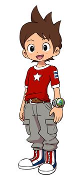
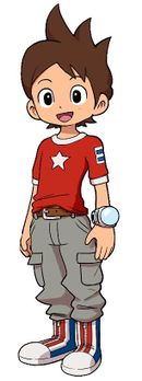
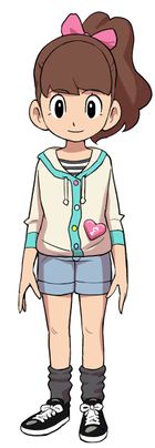
Strangely, when official artwork was posted for the first time in January 2012 issue of Corocoro, most of them look slightly different from their designs in the Level-5 World 2011 Trailer, which are earlier drafts of the characters present at that time. Barnaby Bernstein's design is the only one that stayed the same.
Nathan Adams
| Pre-2011 Trailer Artwork | Final Artwork |
|---|---|
|
|
Nathan Adams was designed to be a character that was "all normal", so he could be symphasized to children who feel that way. Nagano gave Nate a red color, because it evokes a "bright and cheerful feeling". His earlier design may have one of the most interesting changes; his Yo-kai Watch looks near-different! The design of the clock originally looked more like an orb with a faint clock hand, which differs drastically from the design in the trailer. The color scheme of the early Yo-kai Watch was likely reused for the Gate Globes in Yo-kai Watch 2.
Earlier Nate Design?
| Level-5 VISION 2011 Silhouette | Yo-kai Watch anime production art | Pre-2011 Trailer Artwork |
|---|---|---|

|
This silhouette of Nathan Adams was posted on Level-5 VISION 2011 website in August 2011[14], which the pose clearly does not match up with the shape of the revealed artwork.
It was once thought to be earlier artwork until production sheets for the Yo-kai Watch♪ anime series surfaced in late 2021 showing that the basic design does match with the final[15], except that his shoes are shaped a bit differently. This is likely part of an early model sheet that was used in the 2011 trailer, as they share a similar style.
Katie Forester
| Pre-2011 Trailer Artwork | Final Artwork |
|---|---|
|

|
Katie was designed to have a "fashion-conscious" look, where Nagano had taken influences from his daughter's sense of fashion while he was careful not to copy her too much. Katie's blouse looked more like a hoodie and had a small music note pattern on her heart.
Edward Archer
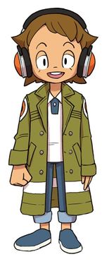
| Pre-2011 Trailer Artwork | Final Artwork |
|---|---|
|

|
Eddie originally wore a longer coat before the sleeves were rolled up, and his shirt design is also different. This initial design was later used in Yo-kai Watch 3 Sukiyaki intro.
Designing the Setting
Creation of Springdale
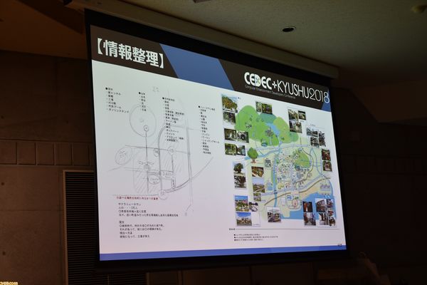
At the CEDEC+KYUSHU 2018, several conceptual artworks for the setting was shown behind closed doors and covered by Famitsu. Those include a very early map layout and changed-around settings that would be repurposed for later games in the series.
Nobuyuki Yangi, explained about how the world of Yo-kai Watch was created and conceptualized, so he took "excitement", "persuasiveness" and "easiness to understand" as general themes of the game. In order to fit the world with Yo-kai, he wanted to add the theme of "Contrast" and "Mix" to the daily life.
Rough Map Draft
| To do: Look at the translations, and try and find the stock images used in the concept art. |
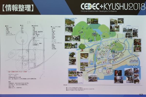
Yangi drew a rough map draft of Springdale, in the form of a tourist map which looks completely different from the final, while it also includes some locations that were changed-around or scrapped entirely. Oddly, a part of the map is reminiscent of St. Mystere from Professor Layton and the Curious Village, where it may have been used as a loose inspiration for building the world.
| Event Image | Slide Mockup |
|---|---|
|
|
| Map Draft (Left) | Map Mockup (right) | ||||||
|---|---|---|---|---|---|---|---|
| Outside | Mountains | Old City District | New Town District | ||||
|
|
|
| ||||
| Map draft (left) | |||||||
| ※What do you know about making different places? Important
Sakura New Town History
Was a castle town that was ruled by Damiyo | |||||||
There were a total of four different districts at this stage in development, each of them having different rough ideas.
- There was originally an "Old City" district, that would have contrasted the "New Town" district, in a way of pushing the "Past and Present" theme of Yo-kai Watch that was decided at the beginning of development.
- An "Old City" district was loosely reworked into Shopper's Row, and Blossom Heights to an extent.
- The "New Town" district matches that of the Springdale concept art seen in 2012 prerelease media.
- Interestingly, only the Adams residence appears on the map draft, hinting that homes had not yet been created for Katie, Bear or Eddie yet.
- The city itself had a fictitious history behind it, stating that it was once a "castle town" ruled by an undisclosed damiyo, with a statue of them in a prominent place in present times. The "statue" was likely reworked into the Golden Egg statue found in Downtown Springdale, while the town's distant history wouldn't be explored until Yo-kai Watch 2: Psychic Specters Quest involving Shogun Waitington.
- A second time period of "Meiji Taisho" (taking place from 1868 to 1926 in real life) is displayed there, but no history was entered there, likely as a placeholder;
- This also contrasts with the fourth sentence that mentions the Showa Period; it lasted from 1926-1989. That era also a key source of inspiration used for designing Yo-kai that appear in the franchise.
Several locations didn't make the cut, but a few of those scrapped locations were reworked into newer games:
- A factory would not appear until Yo-kai Watch 2 in Old Springdale, serving as the penultimate location of the main story.
- A Ferris wheel would appear in Yo-kai Watch Shadowside anime, despite the location itself not being accessible in Yo-kai Watch 4.
- A gasoline station would reappear in Yo-kai Watch 3, located at Southmond in St. Peanutsburg.
- A Shopping mall, which appears in the background of Downtown Springdale in the final isn't accessible until Yo-kai Watch 3.
Later in development, Yangi chose to divide Springdale into six different areas, so they could be unique in their own way while complimenting with the style.
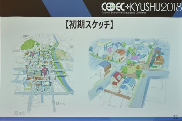
First Sketches
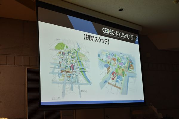
Several sketches of the town's setting, Springdale were shown next, which notably looked a lot more futuristic than in the final game.
| Event Image | Slide Mockup |
|---|---|
|
|
| Translation (Top to bottom) | ||
|---|---|---|
| ??? Area | ||
| ??? | Park | Elementary School |
| Train Station | ??? | |
| Sakura New Town | ||
An earlier version of Uptown Springdale, where it has some notable differences present in this piece of concept art:
- The train station was a lot smaller.
- The road leading to the supposed train station was an overpass rather than a crosswalk.
- The playground (which would likely become Triangle Park in the final game) was enclosed between houses and square-shaped.
- The school was placed on the right side of the district rather than near the top
- The "Park Area" was very small, and may have likely been Mt. Wildwood in the final game.
The image on the left is the same park that was seen in the Level-5 World 2011 trailer of Yo-kai Watch.
| Event Image | Slide Mockup |
|---|---|
|
|
| Translation (Sketch details) | ||
|---|---|---|
| TEST | TEST | |
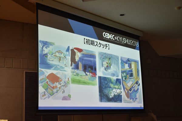
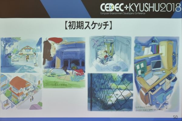
Several rough sketches of Nate and his friends were done.
- Nate's house had a different appearance, looking more rustic and fancier as opposed to a newly-built house
- Smart cars were originally going to be seen roaming the streets, which doesn't appear in the LEVEL-5 VISION 2011 build.
- On the top-right artwork, Nate is seen greeting an unknown woman, which may be a neighbor or an earlier design for Lily Adams, who is Nate's mother.
- The artwork of Nate's desk seems to have been made far in development, appearing in a slightly later piece of conceptual art. It notably also had a computer, which doesn't appear in the finished product.
- In the artwork of Nate on his desk, an unidentifiable Yo-kai can be seen in the wardrobe next to him. It's likely an early draft of Hidabat who would appear in Nate's closet starting from the Yo-kai Watch anime series and eventually Yo-kai Watch 2.
- Jibanyan's design from the LEVEL-5 WORLD 2011 Trailer can also be seen lying on the bed.
Setting Details
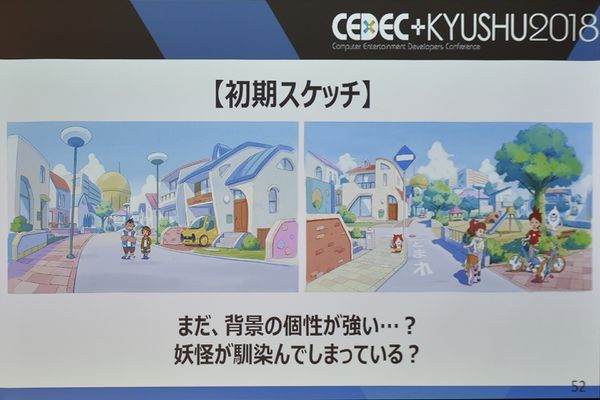
| Event Image | Slide Mockup |
|---|---|
|
|
| Translation |
|---|
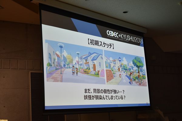
| まだ、背景の個性が強い...? 妖怪が馴染んでしまっている? |
Yangi said that he wanted to make the atmosphere where the player could get a "conscious of ease of attachment" to the setting, and noted that the characters don't stand out much from it. The setting was made more realistic as of a result, which would come to fruition in the game's revelation in October 2011. Despite that, the style would be visited again in Yo-kai Watch Shadowside and Yo-kai Watch Jam: Yo-kai Gakuen Y series.
This is one of the first artworks to be drawn in a different style, rather than just a rough draft. Judging from the pre-Level-5 VISION 2011 designs of characters and setting, this artwork was created before the trailer. The artwork on the right appears in the final, albeit in a more modified manner.
- Bear had a spikier hairstyle, which wasn't carried onto his pre-Level-5 VISION 2011 trailer design
- Jibanyan looks more or less the same, with not much change until his appearance as seen in the trailer.
- Notably, Bear had a more curly hairstyle compared to his appearance in the trailer.
Finalized Springdale
Springdale was designed to be an "average" setting so that the unusual-looking Yo-kai can stand out from it. To further capture the former feeling, elements such as taking off shoes when entering houses (a method of practice in Japan) and traffic rules were added.
Creating a Character-themed Bedroom
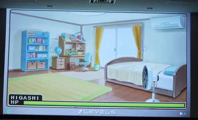
In February 2017, a conference was held for Level-5's for university and high school students in Tokyo, Osaka and Fukuoka, where Nobuyuki Yanai and Yuri Higashimura discussed about designing a setting based on a character's personality, where Higashimura used Barnaby "Bear" Bernstein as an example while he submitted his work to Art Director Mr. Yangi.
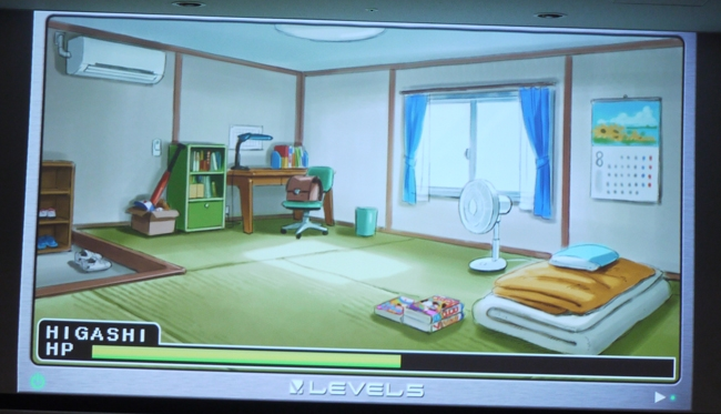
First, Higashimura designed a simplistic bedroom using furniture from Nate's bedroom, but Yangi rejected the first draft. It was because it didn't fit with his personality and image and could be used for any other character besides him, so Higashimura decided to change the setting to an old tatami bedroom to fit the run-down residential area and integrate the blue color from Bear's clothing.
When the overall theme of the setting was changed, Yangi said that he felt like the "character is coming out" but goes on to say that it's "different from his original vision". Higashimura unexpectedly felt speechless at his reaction. Yangi thought it was "too orderly" for Bear's character, despite the bedroom matching part of the setting he had imagined.
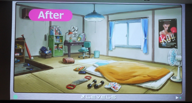
For the third and final take, Yangi gave advice to Higashimura that the "drawing should convey the character", which has to match their hobbies, personality and physique. Higashimura ended up making Bear's bedroom looking cluttered and untidy, where it perfectly matched Bear's rough personality. Higashimura imagined Bear "playing games on his handheld while eating potato chips and left it as it was when he went out to play", and deciding to leave studying for another time so he could play baseball while designing the bedroom, where Yangi was impressed at the result.
Early Music?
It is notorious that Level-5 tends to leave leftovers of developmental materials in various pieces of Yo-kai Watch media, whether it be from spin-off games all the way to promos. Apparent early music surprisingly also counts due to many of the tracks below sounding different from the game's usual style and sharing much of the similar instrumentation used.
Yo-kai Medalland Omikuji Battle
| To do: The Japanese version has way more, but it's lost media...despite it being shown on countless playthroughs with SFX and voice clips. |
In the Korean version of Yo-kai Medalland Omikuji Battle, there are three very early music tracks that share a near-different style from the game's music. This pales in comparison to the musical style from the later LEVEL-5 VISION 2011 trailer, sounding more "kiddy" and not as "ominous" unlike later showings, notably in terms of the xylophone and toy piano instrumentation.
On the other hand, the Taiwanese version of the app has no music or sound effects.
BGM_BG01
A fast-paced theme, possibly serving an inspiration for a battle theme due to loosely having the leitmotif of Vs. Strong Yo-kai near the end.
BGM_LuckyBreak
Used in the application for the Crank-a-kai round. The guitar backing of the theme would be used for Victory!! -2- in Yo-kai Watch 2. It also seems to fit with BGM003 from Yo-kai Watch World below, further implying that this was a victory theme.
BGM_Result
A song loosely sharing leitmotifs of the Yo-kai Watch Theme. The song at the end is cut off.
Yo-kai Watch World
Though Yo-kai Watch World has a few original tracks, the first placeholder tracks included with release seem to be earlier renditions of final themes with a slightly different style. Most of them sound less "kiddy" from the other set of tracks and more "scary", suggesting that they were going through the process of having an overall style balance.
Notably, there's tons of skipped over entries, while the later songs are used-ingame, some of the earlier ones seem to be of early tracks.
BGM001
A more jazzy and louder rendition of the Yo-kai Watch Theme from Yo-kai Watch, sharing very much of the musical style of Yo-kai Watch Theme -3-. There is no loop to the song.
BGM003
An upbeat-sounding song with a subtle march beat applied to it, reminiscent of Uptown Springdale. The beginning of the song appears to have been reworked into a theme in Yo-kai Watch 2. It also has that early xylophone instrument present in other tracks.
Oddly enough, there's a 102BPM version of the song.
BGM046
A much more louder rendition of a battle theme from Yo-kai Watch 2, where it sounds quiet in the second part of the song.
Oddly, there's a shorter version without a loop.
BGM064
A fast-sounding track that sounds loosely like Terror Time - Fleeing, and may have served inspiration for the song.
References
- ↑ https://withnews.jp/article/f0140908000qq000000000000000W00o0401qq000010802A
- ↑ https://toyokeizai.net/articles/-/45794?
- ↑ https://twitter.com/AkihiroHino/status/1414081713018310659
- ↑ https://nikkan-spa.jp/700091
- ↑ https://www.famitsu.com/news/201910/10179572.html?page=2
- ↑ https://dengekionline.com/elem/000/001/704/1704732/
- ↑ https://toyokeizai.net/articles/-/45794?page=4
- ↑ https://twitter.com/NaganoTakuzo/status/1414439184421457925?s=20
- ↑ https://www.shacyoyutai.com/youkai-watch/
- ↑ https://twitter.com/game_yokai/status/1414132353740509187?s=20
- ↑ https://www.famitsu.com/news/201703/16129041.html
- ↑ https://toyokeizai.net/articles/-/45795?page=2
- ↑ https://gnn.gamer.com.tw/detail.php?sn=56991
- ↑ https://ekizo.mandarake.co.jp/auction/item/itemInfoJa.html?index=675144
